15. Juni 2018
Analysing Strava activities using Colab, Pandas & Matplotlib (Part 3)
 How do you analyse Strava activities—such as runs or bike rides—with Colab, Python, Pandas, and Matplotlib? In my third article on this topic, I am demonstrating how to visualize the data in different ways.
Where the previous article left off
In the first article, we have created a Pandas data frame containing individual Strava activities as rows, indexed by both date and type, and showing the respective distance covered during the activity (in km), and the duration of the activity.
In the previous article, we have grouped and aggregated the data in various ways; this is an important step prior to plotting with Pandas & Matplotlib. Let’s look at how to create visualizations in this article.
Download Colab notebook
You can find the Colab notebook which I used for this article here:
File: Analysing_Strava_activities_using_Colab,_Pandas_and_Matplotlib_(Part_3).ipynb [19.92 kB]
Category:
Download: 1306
You can open this Colab notebook using Go to File>Upload Notebook… in Colab.
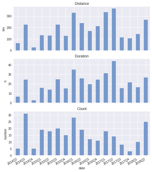
Quarterly: totals
Let’s start looking at the total distance and the total time spent on running per quarter. To do that, we have to sum the individual activities for each quarter; the activities are stored in a data frame like this:
                        distance elapsed_time  count
date                type
2016-08-31 18:51:57 Ride      5km        20min      1
2014-07-31 19:18:35 Run       8km        55min      1
2017-03-15 11:39:14 Run      11km        64min      1
2018-02-11 12:34:08 Run       7km        46min      1
2018-04-24 06:46:24 Run       8km        46min      1
...
We can sum up the activities for each quarter with only a few lines of code:
runs_q_sum = (
    activities.loc[(slice(None), 'Run'), :]
        .reset_index('type', drop=True)
        .to_period('D')
        .groupby(pd.Grouper(freq='Q')).sum())
This is likely to look cryptic to anyone who hasn’t seen a fair share of Pandas before. The library provides a fluent-style interface to query data frame. Pandas exploits Python’s flexibile syntax, while also running into its limitations (e.g. having to use slice(None) as a wildcard). So that’s a downside.
But on the upside, Pandas is quite powerful. In the above code snippet, we first select all activities which are runs. We then retain only the date from index by dropping the information about the activity type. Then, we index the dataframe by day (periodic), which then in turn allows us to use Pandas Grouper in order to group activities per quarter. This yields:
      distance elapsed_time  commute  count
date
2014Q2     62km       387min        4      5
2014Q3    224km      1465min       20     31
2014Q4     25km       157min        0      5
2015Q1    132km       941min       14     19
2015Q2    129km       831min        8     18
...
How difficult is it to plot this data per quarter? Now we have done the hard work, it is going to be a few lines of Matplotlib. Difficult for the first time, becoming much easier the second time.
import matplotlib.pyplot as plt
from matplotlib.ticker import StrMethodFormatter
fig, (ax1, ax2, ax3) = (
    plt.subplots(
        nrows=3, ncols=1,
        sharex=True, sharey=False,
        figsize=(8.025, 10)))
Total distance run per quarter:
runs_q_sum['distance'].plot(ax=ax1, kind='bar', color='#7799cc')
ax1.set_ylabel('km')
ax1.set_title('Distance')
Total time spent running per quarter:
((runs_q_sum['elapsed_time'] / 60)
    .plot(ax=ax2, kind='bar', color='#7799cc'))
ax2.set_ylabel('h')
ax2.set_title('Duration')
Number of runs per quarter:
runs_q_sum['count'].plot(ax=ax3, kind='bar', color='#7799cc')
ax3.set_ylabel('number')
ax3.set_title('Count')
fig.autofmt_xdate()
In a nutshell, once we get a data frame with the right index, plotting a series in that data frame becomes straight-forward. Here is how the plots look like:
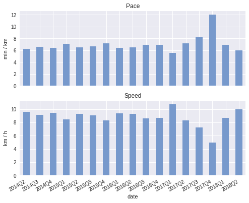
We can also compute the pace, averaged over the whole quarter:
((runs_q_sum['elapsed_time'] / runs_q_sum['distance'])
    .plot(ax=ax8, kind='bar', color='#7799cc'))
ax8.set_ylabel('min / km')
ax8.set_title('Pace')
Or if you prefer velocity:
((runs_q_sum['distance'] / (runs_q_sum['elapsed_time'] / 60))
    .plot(ax=ax9, kind='bar', color='#7799cc'))
ax9.set_ylabel('km / h')
ax9.set_title('Speed')
And the plots:
Quarterly: mean
Going on, we can look at how far I ran on average, and how much time I spent on each run on average.
Mean distance:
((runs_q_sum['distance'] / runs_q_sum['count'])
    .plot(ax=ax4, kind='bar', color='#7799cc'))
ax4.set_ylabel('km')
ax4.set_title('Mean distance')
ax4.yaxis.set_major_locator(ticker.MultipleLocator(5))
Mean duration:
((runs_q_sum['elapsed_time'] / runs_q_sum['count'])
    .plot(ax=ax5, kind='bar', color='#7799cc'))
ax5.set_ylabel('min')
ax5.set_title('Mean duration')
ax5.yaxis.set_major_locator(ticker.MultipleLocator(60))
Plot:
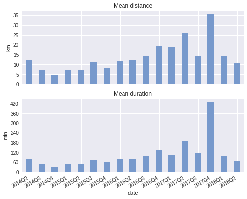
Clearly, in 2017Q4 something odd happened. I did not run much in that quarter, but for one long-distance race. This long-distance race distorts the mean. The mean is not robust to outliers, hence let us look at the median next.
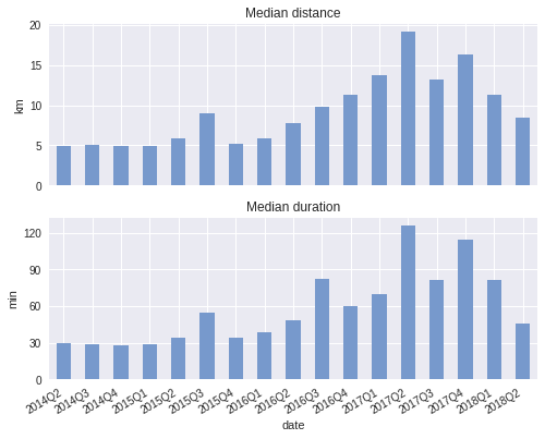
Quarterly: median
Above, we have seen that we can compute the mean distance and mean duration by dividing by count. However, this is not necessary: Pandas has built-in support for computing the mean, median, and other statistics.
runs_q_median = (
    activities.loc[(slice(None), 'Run'), :]
        .reset_index('type', drop=True)
        .to_period('D')
        .groupby(pd.Grouper(freq='Q')).median())
Median distance of a run:
runs_q_median['distance'].plot(ax=ax6, kind='bar', color='#7799cc')
ax6.set_ylabel('km')
ax6.set_title('Median distance')
Median duration of a run:
runs_q_median['elapsed_time'].plot(ax=ax7, kind='bar', color='#7799cc')
ax7.set_ylabel('min')
ax7.set_title('Median duration')
ax7.yaxis.set_major_locator(ticker.MultipleLocator(30))
Plot:
Conclusion
In this article, we have demonstrated how fast you can create visualizations with Matplotlib once the Pandas data frame is in the right shape. There is a learning curve to both Pandas and Matplotlib, so it requires a conscious decision whether you would like to learn how to use these libraries. There are many questions about the Strava activities that we could look into, and for which we could use visualizations. In this article, we have seen how to visualize quarterly trends using bar charts in Matplotlib. In the next article, we are going to─you’ve guessed correctly─apply some Machine Learning to the data. Stay tuned.
Read the next article in this series